6 Effective Call-to-Action (CTA) Ideas to Boost Conversions

Content writer and blog editor at PromoRepublic
Using a perfect call to action (CTA) is often a vital thing of any marketing campaign as it can make it or break it. This is the thing that will directly affect your conversion rates and, thus, the success of your business. US social network ad spending is expected to approach $49 billion in 2021 because marketers spend on ads, and they spend a lot.
So you can imagine how important it is to make a good advertising company that will work rather than just burn your budget. With that much at stake, you can’t just use mediocre and boring CTAs, and if you are stuck for ideas, we got you covered. But let’s start from the very beginning.
- What Is a Call to Action
- Why CTA Works
- CTA Ideas
What is a Call to Action
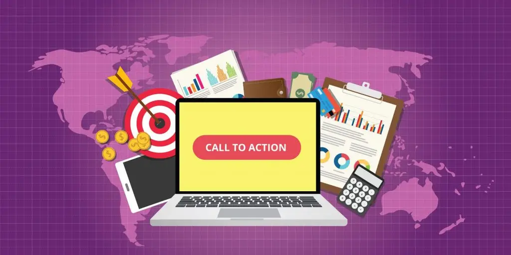
A call to action, commonly known as a “CTA” is a short, engaging phrase used by marketers to propel readers and potential customers towards a particular activity. Think of it as an invitation to whatever company want you to do at the end of ad copy, landing pages, websites, blogs, newsletters, emails, Youtube videos, or any other type of content.
They come in different forms:
- Text hyperlink
- Button
- Plain text with no link
The typical examples are: “Buy Now”, “Try Now “, or longer versions like “Follow us today and never miss a post again”. The possibilities here are endless.
You’re probably wondering if a call to action is so easy to write, how are there still be a bad one? The best CTA’s are those that have won over prospective buyers quickly and efficiently. They are so exciting and compelling that a buyer doesn’t even realize they’re being coerced. But If your CTA phrase is too aggressive and threatens a visitor in some way, and doesn’t deliver a certain amount of excitement, you probably won’t see good results.
It should serve a very specific purpose, and more importantly, it must capture your audience and lead them into their buying decision. Otherwise, it’s not worth the money and time lost once the ad is published.
Why CTA Works
A so-called perceptual set theory in psychology describes how our brain selects, infers, and interprets different information. And this is the reason why calls to action may work. Visuals have become extremely important for marketers because they know that people pay more attention to the things that interest them, and you need to catch the moment.
Not only our desires affect our actions but also our past experiences. For example, if you have a certain level of well-being and you spent some exact sum of money every month, it is ok to assume that something is wrong if you figure out that your life level suddenly changed.
And the last thing is, we interpret information based on our senses and inferences and decide how to proceed next. We see tons of different CTAs every day, especially if we scroll the feed all day long. You can even recognize the registration or sign-up button because you know where exactly it may be and what color it can be on different sites or social media platforms.
Using CTAs on all marketing materials and every platform you’re marketing on is a common practice. There’s a good chance that you would benefit significantly from clickable CTA buttons in plenty of cases. For example, Facebook has short, clickable CTA buttons that you can add to every ad campaign, and that’s why you can see so many landing pages with bright “Sign Up Now!” text in a big yellow button. Clickable CTA buttons have been proven many times over to increase conversion rates significantly. Copyblogger found that if CTAs look like buttons instead of plain text, a conversion rate will increase by 45%.
Average AdWords click-through rates (CTR) hover at about 2 percent. That’s far less than the nearly 3.5 percent CTR you can get in case if you use some good call to action. So, pay attention and pick it right because CTAs inspire action, excitement, and trust.
CTA Ideas
1. The most powerful CTAs are often the simplest
Calls to action should be as short and as easy to follow as possible. Complicated instructions will definitely drive your potential customers away or frustrate them. And that won’t be good for business as well as for brand image. Every possible piece of information, especially the contact one, should be easy to remember or clickable.
2. Provoke emotion
If you want to get an emotional response from your users, try to use a longer CTA. For example,
- Add some numbers: “Buy now and get 50% off!”
- Add more adjectives: “Find your dream house here!”
- Make a promise: “Learn Italian in just 3 months!”
- Influence their FOMO: “Limited time offer. Get your free Subscription!”
Also, the best way to implement a call to action on social media is to make the CTA implied rather than direct. For example, “Our new product is already in stores. Will you come to check it out? It can be more engaging that “New product is out. Buy it now.” Try to make it a bit more conversational, like everything on social media, and it will work.
3. Less is more
When it comes to choices, humans tend to suffer from the so-called choice paradox. We enjoy choosing between two or three options, but present us with ten or more things with different characteristics, and our heads may explode with indecision. One interesting experiment shows that participants who were asked to choose one chocolate from a box of six were happier with their selection than participants who selected one chocolate from a box of 30. So, try to keep your visitors happy by giving them fewer options to choose from. If you decide to give people more options to choose from, make sure one of them is clearly better than the rest. It will help funnel users towards a specific path.
4. Follow the flow
Call-to-action buttons placed towards the bottom or to the right of content often outperform other placements. Do not force your audience to backtrack in order to click a button. CTA buttons should appear in the right places that align with a user’s experience. For example, you would want to put a “book your demo now” button in a place where a user will find it after reading about your offer or product, not before. In another case, it would make no sense for a user to book anything they know nothing about.
5. Use bonus text
Bonus text on CTA buttons in some situations can help to get more leads. This practice is common with free trial CTAs. For example, a free trial button might say “30-day trial” and also “no credit card required” in smaller text beneath it. This valuable info will encourage users to click through to begin their trial. This won’t always be necessary with all buttons, but this extra information can help CTRs a lot when it fits. Also, you can put that additional information underneath or beside a button.
6. Experiment with size and color
Try to make your text really large. Yes, it may seem absurd, but it can draw attention. Such text is definitely easy to read and find. Also, remember that your button color matters. For example, green and orange buttons are reported to perform best, but ultimately it will depend on your site design, as contrasting colors work even better. You wouldn’t want an orange CTA button on an orange background.
Common Rules
- One per page
Try to use a single CTA with one piece of content like email, blog post, social media post, Youtube video, etc. If you use the second one, you will basically cut your visitors’ attention ratio in half and worsen your chances of getting a click. Don’t be greedy and let the single call-to-action button do the job.
- Make it hotter
You know that aggressive CTA will not work well with cold traffic. For example, if you want your agency to get some new clients and use something like “get a free consultation” right after a short introduction, most people will ignore it. Sometimes companies choose just to throw more money in such an advertising campaign to get more eyeballs with a chance that at least some visitors will become interested, but there is a better option. Try to give more information about what a client can get. A description of the client’s specific problem following a short description of the company’s work can help. So, the final scheme is simple: Short description > mark a problem > tell how you can help > CTA. Such a chain will make your audience hotter and increase your chances of getting clients.
- Add some contrast
That’s the simple one. Make sure your CTA button color pops against other elements on the page and make it the opposite of the background color. These are so-called complementary colors, and you can find the perfect pair using Canva Color Wheel.
- Lead them carefully
Don’t try to get people’s personal information like name, phone number, and email at the end of some landing page. They don’t trust you enough, and everybody knows that right after you leave your email, you’ll get some sort of “hello and welcome to tons of spam” message just to click “unsubscribe” right away. Lead your visitors carefully by giving them helpful information and asking some easy questions step by step. Then, after a few questions and portions of yummy info, they will be ready to click the CTA button to get the biggest prize (free month? consultation?) and give you the email.
- Be creative
Boring CTAs are boring. Forget about “Submit” and “Subscribe” if you want to earn something. Make it personalized because it will perform 202% better and use clickable buttons instead of plain text call-to-actions to get a 28% click-through rate more.
- Keep it on the screen
Don’t make people scroll down for your CTA. It should be visible and high enough not to scroll down because even such a small additional action can lead to customer loss. So keep the button right in front of their eyes and don’t let them miss it.
- Offer a solution to a specific problem
Try not to include multiple commands in one CTA. Ask the user to complete only one thing – sign up for your email list or view your latest blog post. One button can only manage one task, so don’t confuse your visitors. Also, make your website full of CTAs. Sure, you can have several calls to action on a single page, but you don’t want them to conflict with each other. Consider examining the heatmaps of your pages to see where the hot points are because there are the best places to put your CTAs to maximize visibility.
- Use the right words
Your message should be clear, strong, and persuasive. Let the reader know precisely what you want and why he or she should do it.
- Create urgency
Such a move can help you sell more because people react to things like limited-time offers. But be careful and don’t create false urgency because it will make visitors cheated and manipulated.
- Test your options
CTA location is very important because you want people to see it and pay attention to it. That’s where scroll maps will come in handy. They show you where the user often stops scrolling before clicking away, and this the best place to put your CTA because it’s more likely to be seen. Testing is the only way to be sure, though. Use your scroll map and make an educated guess to figure out what placement yields the best conversions.
In addition, consider the actual call to action text and image. Tests will help you decide which one produces the best results for your brand. A/B testing works best when you’re only testing one variable at a time. If you test more than one, you won’t know which variable contributed to conversions or whatever metric you’re tracking.
A well-constructed and delivered call to action changes minds and ignites action. It creates a critical turning point at the end of any kind of content, and the audience can understand the role they can play after leaving your speech. The CTA gives people concrete tasks to tackle, and these tasks must be completed to bring your ideas to life and give buyers something valuable too.
An audience can be thoroughly gripped by your narrative and convinced to believe what you do, but if they leave not knowing what they are supposed to do with your ideas, your presentation will be pointless. The way to ensure that your call to action persuades is to keep in mind that one size does NOT fit all, and you got to tailor your CTAs.
People respond to different types of calls to action based on their daily activities, goals, and interests. So, if you want to be sure that your call will actually get a response, you should get to know who is in your audience before you decide how you’re going to deliver a message.


